Your cart is currently empty!

What is the Corporate Memphis Art Style?
In recent years, you may have noticed a particular illustration style dominating the websites and marketing materials of tech companies and startups. Characterized by flat designs, bold colors, and abstract human figures, this visual approach has become ubiquitous in corporate branding. This style is often referred to as Corporate Memphis. But what exactly is Corporate Memphis, and why has it become so popular?
What is Corporate Memphis?
Corporate Memphis is an art style that features flat, minimalist illustrations with vibrant colors and simplified shapes. The style often includes abstract human figures with exaggerated proportions—long limbs, small torsos, and minimal facial features. These illustrations are designed to be friendly, approachable, and universally relatable.
Origins of Corporate Memphis
The term “Corporate Memphis” is a nod to the Memphis Group, an Italian design and architecture collective from the 1980s known for its colorful, geometric designs.
However, the contemporary Corporate Memphis style has its roots in the flat design movement of the early 2010s. Companies like Facebook, Airbnb, and Slack began adopting this style to create a modern and inclusive brand image. Various specific illustrators have been credited with starting Corporate Memphis like Alice Lee who worked for Slack and the design company, BUCK, that created Facebook’s variation of the style.
Key Characteristics of Corporate Memphis
Flat Design
The foundation of Corporate Memphis lies in its flat design aesthetic. This means there’s an absence of three-dimensional effects like shadows or gradients, resulting in a clean and modern look.
Bold, Vibrant Colors
The use of bright and bold colors makes the illustrations eye-catching. These colors are often used to evoke positive emotions and make the brand appear more engaging.
Abstract Human Figures
One of the most distinctive features is the portrayal of people. The figures are abstract with exaggerated limbs and minimal facial details, which makes them universally relatable.
Simplified Shapes
The illustrations use basic geometric shapes, making the visuals easy to process and understand at a glance.
Why Do Companies Use Corporate Memphis?
Universality and Inclusivity
By using abstract figures with minimal defining features, companies aim to create images that anyone can relate to, regardless of their background. This promotes a sense of inclusivity and diversity.
Brand Approachability
The friendly and informal style helps in making large corporations seem more approachable to the general public.
Cost-Effective and Scalable
Creating flat illustrations is often less time-consuming and more cost-effective than more detailed artwork. This makes it easier for companies to produce large volumes of content quickly.
Criticisms of Corporate Memphis
Lack of Originality
As more companies adopt this style, critics argue that it leads to a homogenization of corporate branding, making it harder for individual brands to stand out.
Oversimplification
The abstract nature of the illustrations can sometimes come off as impersonal or insincere, failing to genuinely represent the diversity they aim for.
Visual Fatigue
With its widespread use, audiences may start experiencing visual fatigue, reducing the effectiveness of the illustrations in capturing attention.
The Future of Corporate Memphis
While Corporate Memphis has been the go-to style for many companies, there’s a growing trend towards more authentic and unique visual representations. Brands are beginning to explore alternative styles that offer more depth and personalization.
Conclusion
Corporate Memphis has played a significant role in shaping the visual landscape of modern corporate branding. Its emphasis on simplicity, inclusivity, and approachability has made it a popular choice among tech companies and startups. However, as with any trend, its overuse has led to criticisms and a push for more originality. Whether Corporate Memphis will continue to dominate or make way for new styles remains to be seen.
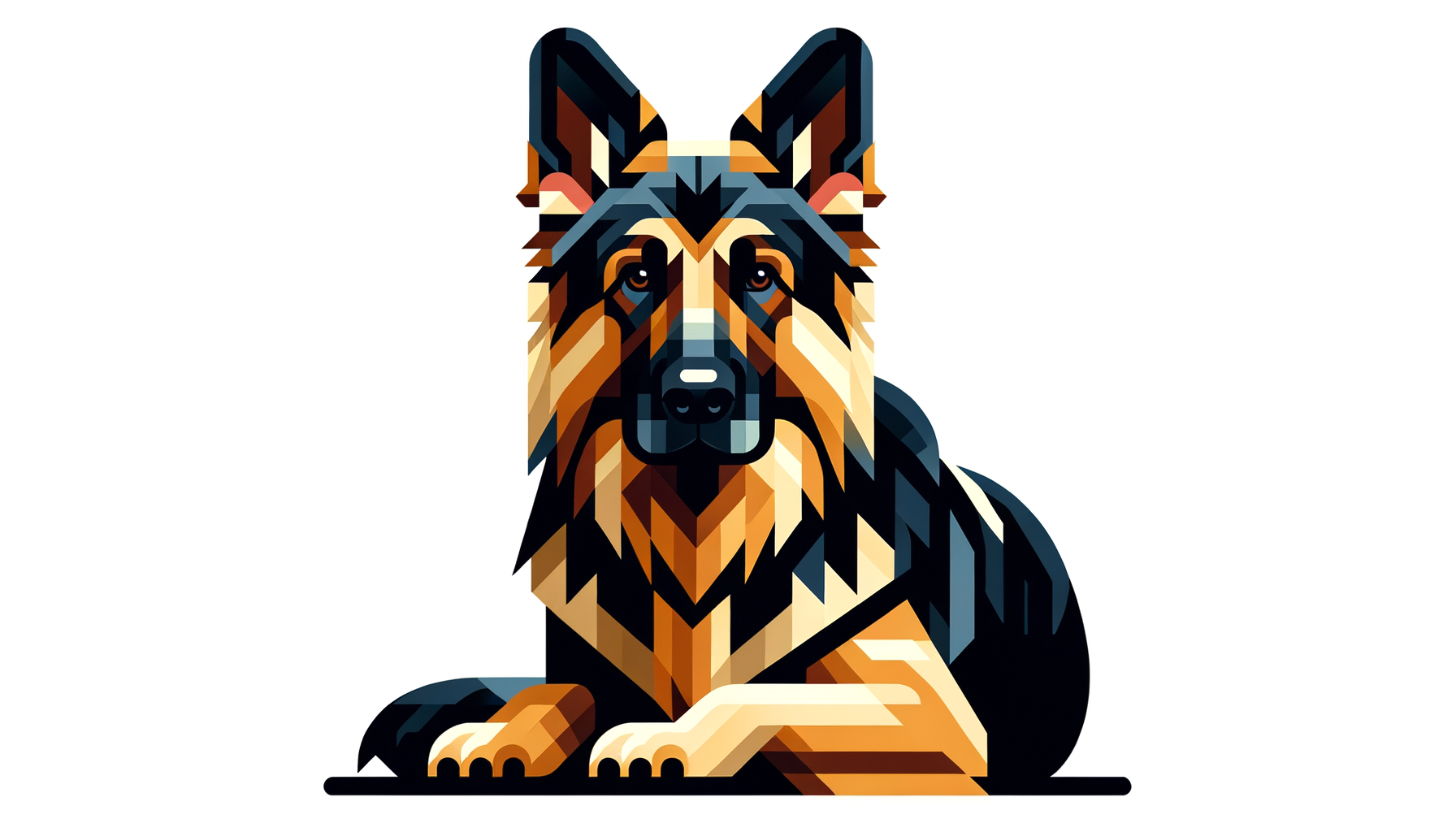
With our AI Custom Pet Art, early users have found Corporate Memphis to be a favorite art style. Although the MoodleMakes AI often doesn’t quite nail the exact style of Corporate Memphis, using this style as the Style Prompt often results in bold, colorful designs of the pet photo you upload.
Give it a try for free by creating your first MoodleMake.

FAQs
What companies use Corporate Memphis?
Companies like Facebook, Airbnb, Slack, and Asana have prominently used the Corporate Memphis style in their branding and marketing materials. However, it is so widespread now that you will find thousands of companies adopting variations of Corporate Memphis.
Is Corporate Memphis the same as flat design?
While Corporate Memphis incorporates flat design principles, it is a specific style within the broader flat design movement, characterized by its abstract figures and bold colors.
Why is it called Corporate Memphis?
The name is inspired by the Memphis Group, an Italian design collective from the 1980s, known for its colorful and abstract designs.
The origins of the Corporate Memphis art style specifically can be traced back to several illustrators and design firms who helped popularize it. Alice Lee, an illustrator who worked for Slack, played a significant role in shaping the style with her unique and approachable illustrations. Additionally, the design company BUCK created a variation of the style for Facebook, contributing to its widespread adoption in corporate branding. These contributions from individual artists and studios have collectively defined what we now recognize as the Corporate Memphis aesthetic.
